


34 comments on "Columns.ai"
Have any questions? Ask the founders here.
You must be logged in to post a comment.
One-time payment. Lifetime deal.
You have data and insights to share. But it’s difficult to do so in a way that tells the whole story accurately and convincingly. Visual representation is usually the best option, but it is highly time-consuming, and often requires design expertise. (“This is taking forever. I bet that by the time I can share this data, it will be completely out of date.)
Finding a way to captivate your audience by turning boring data into stunning visuals can be a challenging process, but all that effort could go towards other aspects of your business.
You need a way to easily create and share insightful data visualizations with just a few clicks.
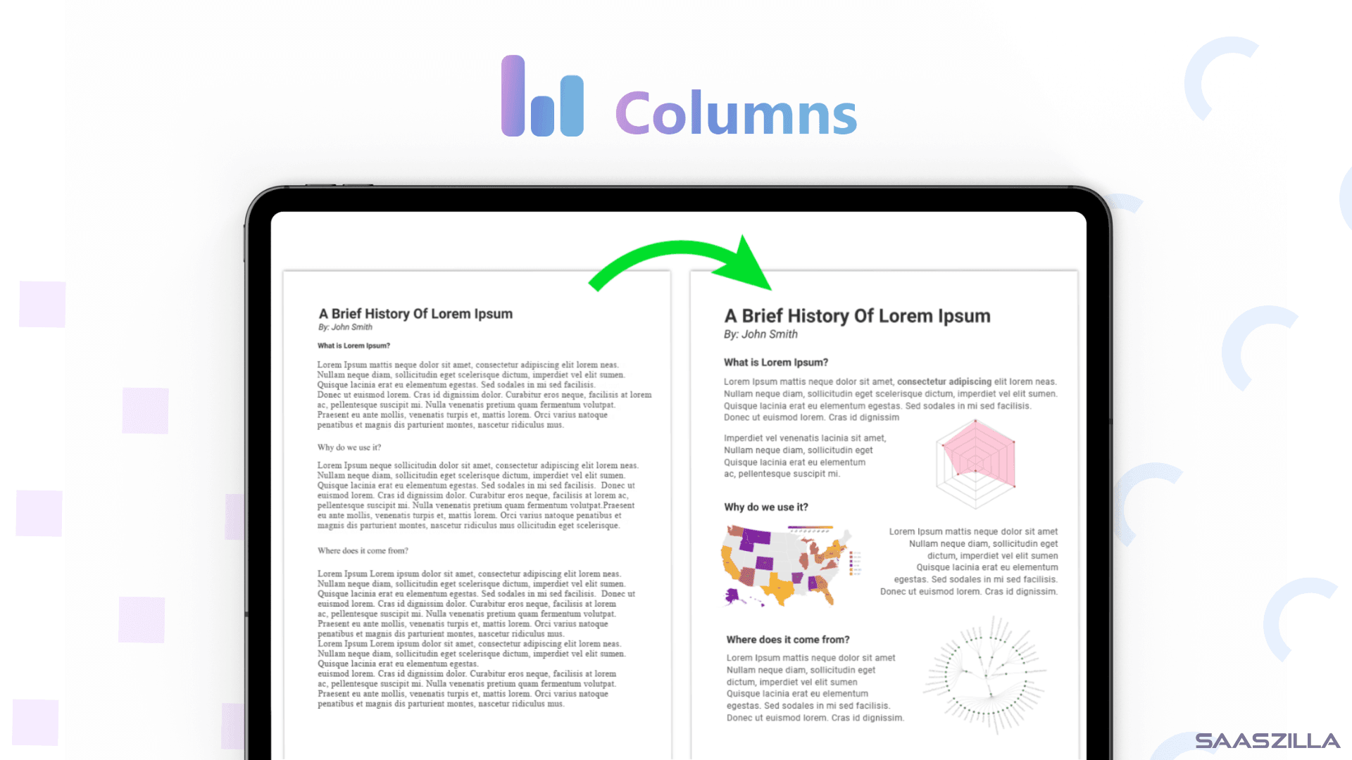
Columns makes it a breeze to turn your data into beautiful interactive storytelling graphics that are easy to analyze and understand.
Connect any of the available integrations (Notion databases, Google Sheets, Snowflake, Databricks, a REST API…) or upload your data directly via CSV file with all the important data for you and your business that you want to analyze and present in comprehensive charts.
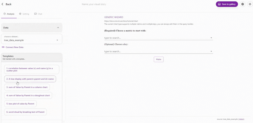
Thanks to the numerous templates and the automatic initial insights and visualizations that Columns proposes right after scanning your data, creating and switching between data visualizations is just a few clicks away.
But that’s not all, because with the AI query assistant’s natural language processing included in Columns, you can request specific visualizations as if they were coming from your personal data analyst. Quite simply, you don’t need any additional skills.
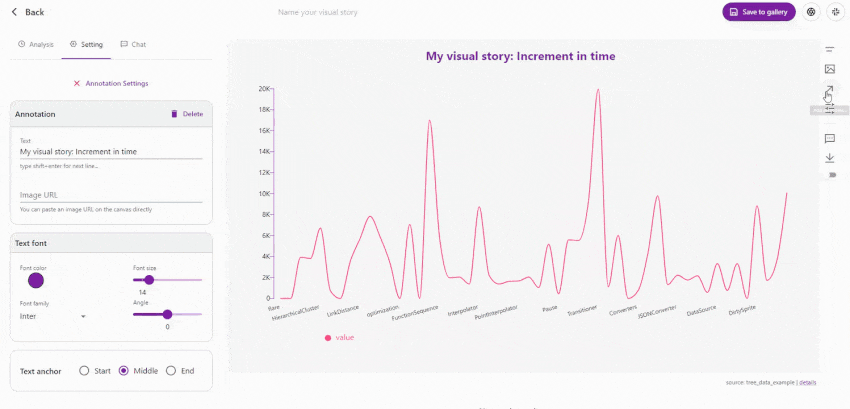
Columns also includes a graphics editor that lets you spice up and customize your visual stories. Add annotations, smart widgets, images and other built-in tools to make each of your creations unique.
As simple as dragging and dropping one of the elements onto the canvas. Edit titles, subtitles, and captions to make sure your story is told clearly. You can even create highlighted sections of data to make them stand out and clarify their presentation.
Add your brand logo and change the color scheme to match your branding, and you’re ready to share with your audience.
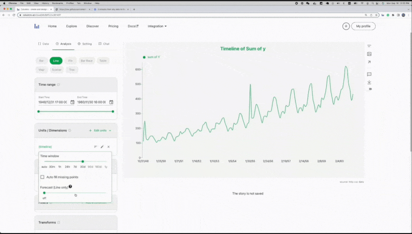
Columns AI is a powerful tool for real-time data analysis. With features like data forecasting, it helps you see the future using predictions based on the data you’ve already provided.
This is useful for financial models, for example, to predict revenue trends for the next few months based on past periods, or to understand how churn and new signups will affect your future membership/subscription revenue.
Only if you’re able to understand the data of your business, you can make the best possible decisions.
This all sounds great, but it wouldn’t be so funny if you kept it to yourself.
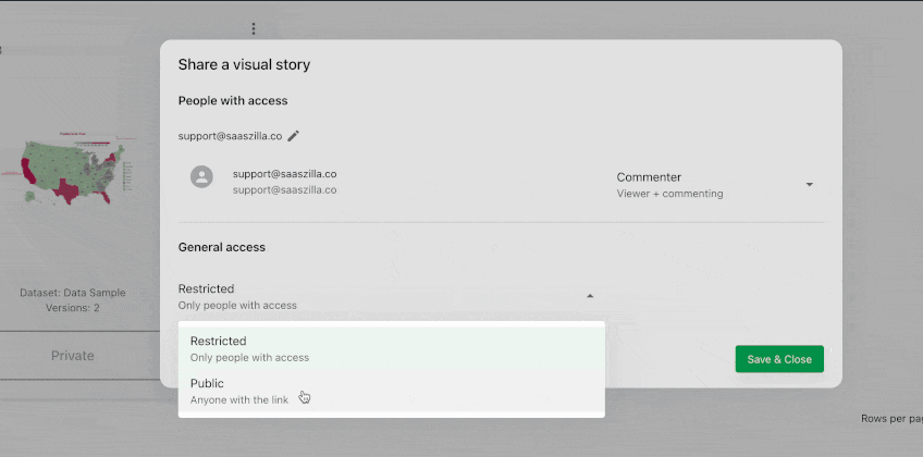
Luckily, you can invite anyone via email and set different permissions for each person. It can be a colleague, a data analyst, a designer, etc.
Just like Google Docs, you can give them view-only or comment-only permissions. Or you can give them full editing rights.
But what if you want others to be able to see your charts without having to log in?
Because Columns supports public sharing and embedding of visual stories. The Headless version is perfect for creating dashboards that automatically sync data on a schedule. Share a direct link with your audience on social media or even embed it in your blog posts or presentations.
The flexible collaboration and sharing features make Columns the perfect partner for any agency or content creation team.
Since data is everywhere, you can’t ignore it just because it looks complicated. You need a way to master it and use it in your favor. (“I’m angry and will hold my breath [until data becomes user-friendly].”)
With Columns AI, you can create stunning visual representations of your data and share it easier than ever to engage your audience.
Spice up your content and share interactive visual insights that people will enjoy.
Get Lifetime access to Columns AI today!
60-day money-back guarantee. Try it out to be sure it’s the right fit for you!
We Got Your Back guarantee
One-time payment. Lifetime deal.
60-day money-back
We Got Your Back guarantee
Hey, awesome community!
This is Shawn with Columns!
Glad to see you here, after 16+ years of building various data products in multiple companies (mainly Microsoft, Facebook, and Pinterest), I started off building Columns in September 2021, a web-based data storytelling platform powered by cloud computing. Because of the tech foundation, Columns easily supports various data sources including but not limited to
From these data sources, you and your team could collaboratively work on storytelling, design, and communication with ease, and hopefully joy as well.
At the current stage, I would like to highlight a few features that we focus on, to deliver a smooth data storytelling experience:
We are just at the beginning of our journey to build the best data visualization platform for collaboration, and sharing meaningful insights, you’re the early adopters, and I really appreciate your support, and wish we could be helpful in any way. This deal is a lifetime premium membership.
You can reach me at support@columns.ai, or follow us using any of the channels listed at https://columns.ai/contact
Cheers! Shawn Cao
You must be logged in to post a comment.
Columns.ai – We want to highlight this POSITIVE examples of LTD here which is doing exceptionally well.
Columns is a “Data to Chart” visualization and story telling tool.
We bought a code of Columns from Kai’s SaasZilla a few weeks ago. Since then, the software has evolved tremendously and the passionate founder and his team are releasing update after update.
One example is the latest feature that saves a lot of time and effort, We are just amazed about this:
–> The *personalization* of every single Storytelling Graph output.
Before, it took 1 minute to (re)format, (re)write, (re)place the name a graph belonged to.
Now, with today’s latest update, it only takes 2 seconds to do the same: Personalize and download each chart while keeping (!!) the same formatting.
Here are some use cases that will benefit from this new feature (and of course there are many more):
1. Training seminars: Handing out personalized assessment results to participants with individual naming on each of them
2. Medical reports with the name of each individual patient
3. Engineering: Comparative performance tests with specific engine names used
4. Schools, Universities: Quick download of individual progress cards with the student’s name
5. Research: Results with a specific population displayed on the chart
6. Marketing: Visualized and downloaded AB test results with indication of test conditions
Number 1 above is the use case WE need, and we are now actively using Columns for our training seminars. It has solved many problems at once.
————-
I am not affiliated with Columns.ai and receive no benefits for posting this. I just feel that Columns deserves a “positive mention” and that we should post more positive cases here with amazing founders.
This post also serves as an update for those who bought a code already. And this is just one of the many updates made in recent weeks.
Only logged in customers who have purchased this product may leave a review.
We take your privacy seriously. Learn more in our terms of use & privacy

Good day! and hi, Kai :'D
FYI, I have asked these on Facebook:
-For handling teams, does everyone in the team see everything?
-Can we group teams into separate groups?
-How granular is the team access to the data in my account?
-Can we share to others without needing them to sign up?
Thanks!
Hello!
While there are team mates and permissions (you can also share with others without signing in but not sure what you have in mind). You might have particular requirements for your workflow use case.
I'd recommend you to best try the pro version by yourself. The deal offers 60-day refund guarantee too. Cheers!
Can the charts be animated like I see on youtube videos?
Charts are interactive indeed!
Is there a whitelabel when purchasing the highest package?
Hi, the creator has confirmed that there are no current plans to include whitelabel for the product. Regards
Can it be used to create images for WordPress posts?
Sure!
You can embed your Columns AI graphics every website that allows embeds, included WordPress.
Regards.
Shawn is just about one of the nicest guys you'll meet in this space. It's a nice piece of kit too. Go Shawn!
Thanks for your recognition!
I really like the concept and crazy flexibility of Columns AI.
But I have some questions before I can buy
1) How about GDPR? As it seems that this is a US Company, I think the servers will be in US too
2) That makes it hard for me to simply embedd these beautiful charts into my website, because then at least their IP adresses get sent to the US, which is not okay without the users permission.
So any solution to solve that problem for us? It would be awesome, if we could export a static version (HTML/JS/CSS) of a chart we have built, because then I could implement it without embedding from a US server. This would be a solution.
The other solution would be: GDPR compliancy + DPA + Cookie banner allowance of the user + EU Servers to embed from + no tracking at all from ContentStudio in the code.
So all in all, I think the simple export function of a static copy would be the easist to implement for you guys
3) What about users. Is that only the (admin)users, that create charts?
So if I would buy 6 codes I get unlimited users – thats all the difference, right?
So unlimited admins, correct?
4) Is the API limited? What are the limits? And what can we do with it?
5) Any plans to make the interface multilingual? German would be interesting on my side
Hi Jens,
Thank you for your questions! See some comments inline
1) How about GDPR? As it seems that this is a US Company, I think the servers will be in US too
[Shawn] Columns does not collect user information except the login email only. With the minimal user data practice, we believe it's completely GDPR compliant. Columns serve global users.
2) That makes it hard for me to simply embedd these beautiful charts into my website, because then at least their IP adresses get sent to the US, which is not okay without the users permission.
So any solution to solve that problem for us? It would be awesome, if we could export a static version (HTML/JS/CSS) of a chart we have built, because then I could implement it without embedding from a US server. This would be a solution.
The other solution would be: GDPR compliancy + DPA + Cookie banner allowance of the user + EU Servers to embed from + no tracking at all from ContentStudio in the code.
So all in all, I think the simple export function of a static copy would be the easist to implement for you guys
[Shawn] That is probably true, I think your website should have the Cookie consent popup, Columns embed should be part of your website content, instead of asking users to consent on it again.
Plus, you can completely export each graph as static assets, such as SVG or PNG images, if you think that is more appropriate for your website. Feel free shoot more questions at support@columns.ai, love to have more discussions.
3) What about users. Is that only the (admin)users, that create charts?
So if I would buy 6 codes I get unlimited users – thats all the difference, right?
So unlimited admins, correct?
[Shawn] A team plan will allow you to add as many users as the seats created, all added members share the same workspace, and everyone has permission to create, edit, and chat about all the content in the same workspace, in your context, those members are admins, though every team has one admin who can manage all the settings though.
4) Is the API limited? What are the limits? And what can we do with it?
[Shawn] API allows you to seamlessly create Columns graphs through coding, and it returns you the Columns Graph URL which you can dynamically embed or display. You can also use a pre-made graph as a template and combine it with new data through API to get a new graph so you don't need to edit and design again.
5) Any plans to make the interface multilingual? German would be interesting on my side
[Shawn] long term yes, short-term no, running short on resources for this.
If I buy Tier-1, how many facebook and google ad accounts can I connect? Will the reports and charts be responsive (mobile friendly) so users can view them alright on mobile browsers?
Yozee, Columns currently doesn't support connecting to Facebook/Google Ads account directly. You may need to export your data CSV or GoogleSpreadsheet that Columns currently supports.
The graph is responsive, it should auto fit on any screen size.
nevermind.. you already answered the same question before. Thank you SAaszilla..Team
Hi Shawn, a beautiful product!
We would urgently need a gauge chart. Are you planning to add this soon?
And is there a current workaround for the gauge chart right now?
Thanks! 🙂
Is the feature set offered here the same as in AppSumo?
Yes, both are the same offer that's right, except we have higher stacking with more benefits by now.
How long will your offer be available to buy here @ sasszill.com, what is the final day to purchase this?
Hi,
We usually don’t set everything in stone, so our deals can certainly abruptly disappear at any time.
This could occur for various reasons, including the team behind the tool meeting their goals such as the number of units sold, signups, an impending funding round, etc.
In this particular case, you’re likely aware that our deal is the most advantageous on the market. However, this will soon change as we reduce the limits on the stack, which cannot remain with unlimited users indefinitely. Additionally, we have already decided that we will be adjusting our prices to match those currently offered on AppSumo, as no special discount can last forever.
Said that, if the current deal good for you, why not taking advantage of it right away and secure yours?
With our 60-day money back guarantee, you have nothing to lose, so I wouldn’t postpone it.
What are your plans for this tool moving forward? Do you intend to integrate ChatGPT or GPT4 into the chat wizard bit? Cos the data chat isn't really that helpful yet.
Thanks for your question – Columns will be the easiest tool to analyze and visualize your data into a beautiful story. AI is definitely a big part of it, but as you saw, we're not there yet. GPT is already integrated, and the experience is under constant developing, follow us in anyway (https://columns.ai/contact) to receive updates.
Can you create bubble graphs/charts as well? Going to grab 2 codes if we can!
There are a lot of different graphs/charts that you can create, included "scatter" which are those with bubbles (I'm not really a pro on this, but I think you are refering to those). You can check the specifics about that one and all the rest in the ColumnsAI official documentation 😀 https://docs.columns.ai/docs/tutorial/chart/scatter
Hi Daniel,
Kai's reply seems to hit the point – when people talk about "Bubble", most of the time, they refer to scatter plot, but also sometimes, they may mean for another context. On Columns, you may see "Bubble" or "Dot" in these graphs:
1. Scatter uses bubble/dot to show values correlation between X metric & Y metric, you may use 3rd metric and 4th metric for bubble size and bubble color.
2. Line chart could be plotted in Bubble, Line, or Area
3. A map (currently on a US map) can have a bubble on it, using size to measure the metric value.
Let me know if any type fits your use case, happy to answer if you have more questions.
Hi Kai and Shawn,
My apologies for not being clearer. This was my I meant – a circle packing graph like this https://r-graph-gallery.com/circle-packing.html that's used to show frequency and also maybe hierarchy. I couldn't figure that out from Columns. It's sort of like a glorified version of the word cloud that Columns has but works with any data.
Thanks for the help!
Hi Daniel,
I see what you were looking for, thank you for your clarification. We don't have a bubble packing graph currently, the closest one is probably the Tree Map, for example, https://columns.ai/visual/view/cAWJw1ihr8zbX8
I like the bubble-packing one as much as you do. If you don't mind, could you please create a feature request here – https://columns.canny.io/feature-requests, I'll prioritize the support for it. More votes, better in priority, but I'll prioritize it anyways since you're on Columns already.
Hi,
I have a question, if I stack 6 codes, will I really get to add an unlimited number of team members?
That's right. 6 stacked codes at the moment of this comment provides you with unlimited team members. Cheers!
That's not what the owner said, he said those additional 5 codes are simply seats for additional team members, meaning one can add up to 5 team members, now I'm really confused.
Hi, I have just talked to Shawn, Column's founder, and he confirmed that our limits are the right ones. Don't worry, this is probably just a misunderstanding. The founder will comment soon here for reassuring you on this information.
Thanks for your comment 😀
Hi @Mya & @am.ab,
Yes, this is Shawn – I chatted with Kai this morning. It was my miss on this term on the deal, I apologize for that. As Kai said, we will ensure you can add unlimited members to the team created by 6 stacked codes.
Since it was a misunderstanding, the system doesn't support this currently, but it is in our TODO list now, once it's done. You will see "unlimited" seats on your team page. Feel free to reach out if you have more questions!
Just grabbed a code! Hope the extension works as it announced (the only review is from the maker itself…) 🤞
Hey Pepe, thanks for your trust! This is Shawn, the maker you just mentioned. The extension only works with Google spreadsheet currently, let me know if that is what you expected, and I'm happy to answer questions you may have.